 6:44
6:44It’s not you - movies are getting darker.
Save referenceIdentity & Self-Relevance
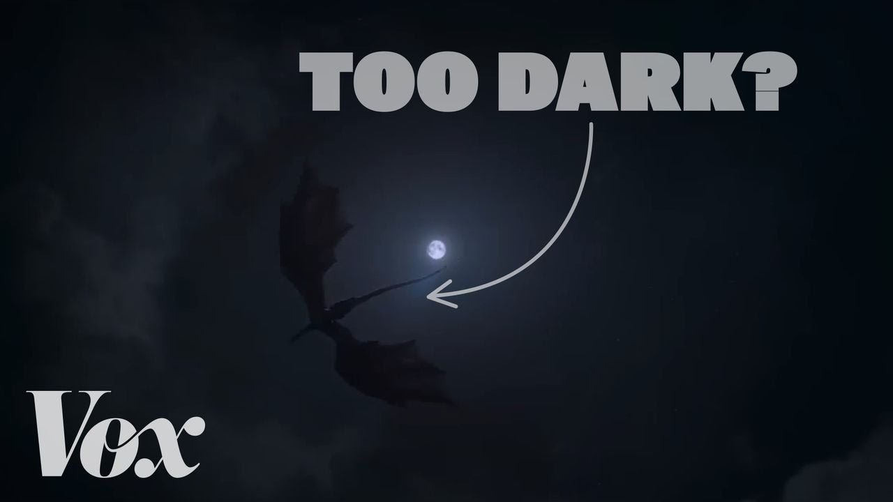
You have squinted at a scene exactly like this one. The image is genuinely hard to read, so it proves the complaint before a word is spoken. Then the title hands you relief, it is not you, and the why sits behind the click.
The title absolves the viewer and states the trend as fact.
The thumbnail is nearly black on purpose, performing the exact problem it names.
When people blame themselves for a problem you can explain, let the image demonstrate the problem itself. Keep one clear text anchor, because an unreadable thumbnail with no anchor is just unreadable.
Let the image commit the crime the title describes.
What to avoid copying
This breaks the normal contrast rules on purpose. Copy the demonstration idea only when dimness is literally your subject.
Apply this pattern to your next video.
Bring the reference into a packaging brief, then decide what your title and thumbnail should each communicate.