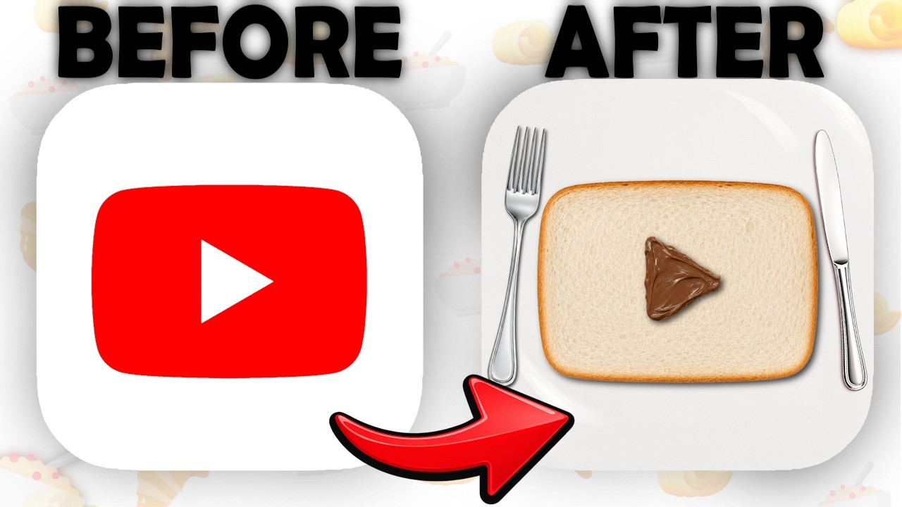
Everyone on YouTube knows that red play button, so seeing it remade as bread with a chocolate spread triangle is silly and clever at once. The title says App Icons, plural, so you click to see what the other apps became.
How the packaging works
Title
Capitals on FOOD put the weight on the twist, and 'App Icons' in the plural tells you the YouTube one is just a sample of the set.
Thumbnail
BEFORE and AFTER with a big red arrow leave nothing to work out, and the fork and knife make the second icon read as a meal even at feed size.
Remix this
When your project reworks something everyone recognises, show the original beside your version of the most familiar one. Let the title say there's a whole set, so one example makes people want to see the rest.
The transferable lesson
Remake the most familiar one, and promise a whole set.
NicheGraphic Design
Click driverExpectation ViolationCuriosity Gap
Visual signalArrowBefore and AfterSide-by-Side ComparisonTransformation
Turn the lesson into a decision
Apply this pattern to your next video.
Bring the reference into a packaging brief, then decide what your title and thumbnail should each communicate.
 5:09
5:09