 5:42
5:42The ONLY resources you need to design award winning websites
Save referenceCuriosity Gap
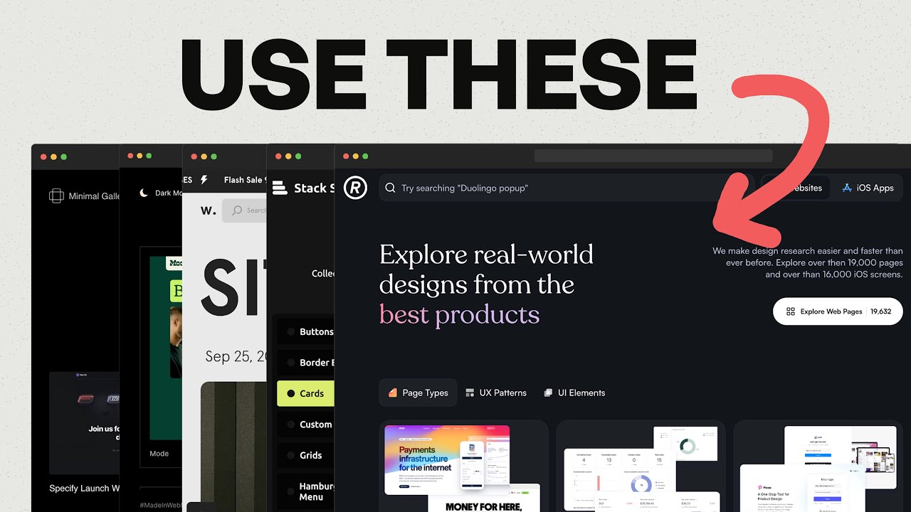
Web designers always want to know which sites the pros use. The thumbnail fans out five real resource sites like a hand of cards, but at feed size you can't read their names. USE THESE says trust me, so you click to find out.
'ONLY' promises a short, complete list that ends the search, and 'award winning' sets a high bar, which appeals to designers who want their work to stand out.
The windows overlap like tabs in a busy browser, which looks like real research, and the red arrow picks out one to make the list feel personally chosen.
When your video recommends tools or resources, stack their real screens so they look genuine but can't be read at feed size. Add a short command and one arrow, and let the title promise the list is complete.
Show the tools are real, but not which ones.
Apply this pattern to your next video.
Bring the reference into a packaging brief, then decide what your title and thumbnail should each communicate.