 8:01
8:01Why Europe Is Insanely Well Designed
Save referenceExpectation Violation
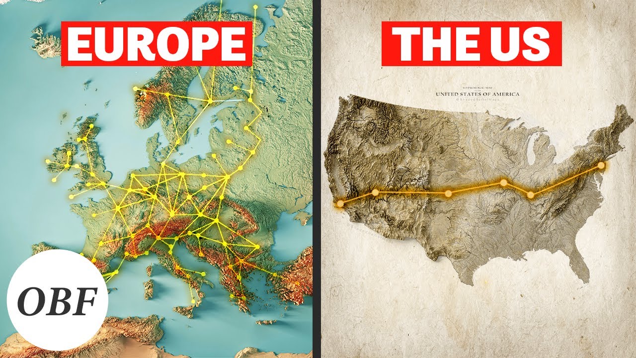
Europe is wrapped in a glowing web of routes. The US, right beside it, has one thin line. For many viewers that gap breaks what they assumed about their own country. The comparison does the arguing before a single word is read.
Title
The title claims Europe is better designed and offers the reasons.
Thumbnail
The thumbnail proves the claim at a glance with a dense web against one thin line.
Use this when one side of a comparison is shockingly thin. Draw both as simple maps or charts and label them. The weaker side should look almost empty, because the emptiness is the message.
Let a lopsided comparison make the argument visually.
Turn the lesson into a decision
Apply this pattern to your next video.
Bring the reference into a packaging brief, then decide what your title and thumbnail should each communicate.